Power BI: Calculating cumulative values


Mastering Cumulative Values – A Comprehensive Guide
Cumulative calculations are an essential part of data analysis and reporting, especially when it comes to understanding trends and patterns over a specific period. In Power BI, cumulative calculations allow analysts and business users to track the development of metrics such as revenue, customer growth, or expenses over time. This technique is particularly useful for evaluating the overall performance of a company or department.
Introduction to Cumulative Calculations
In the world of data analysis and business intelligence, the ability to identify and interpret trends and patterns in business data is invaluable. This is where cumulative calculations come into play, especially in a powerful tool like Power BI. These calculations are crucial for gaining a deeper understanding of how key business metrics evolve over time. Cumulative calculations in Power BI are methods that allow data to be aggregated over a period to analyze continuous trends and overall performance. This type of data processing is particularly valuable for tracking the development of key indicators such as revenue, customer acquisition, or total expenses. They provide a perspective that goes beyond looking at isolated data points, enabling the assessment of a company's or a specific department's overall performance over time.
Cumulative calculations are versatile and offer valuable insights across various business areas:
- Financial Analysis: Tracking revenue development to identify growth trends or evaluate financial goals.
- Marketing: Assessing the long-term impact of marketing campaigns on revenue or customer retention.
- Sales Management: Monitoring cumulative sales figures to measure the effectiveness of sales strategies.
- Project Management: Tracking the cumulative progress of projects against schedules and budgets.
Power BI stands out as a tool for cumulative calculations due to its ease of use and flexibility. By combining intuitive DAX functions with versatile visualization options, Power BI enables users to perform complex cumulative analyses and present them in an understandable format. The platform not only supports the creation of meaningful cumulative data models but also allows these insights to be shared and communicated through interactive and visually appealing reports.
Using CALCULATE and FILTER to create cumulative totals
Power BI offers DAX functions (Data Analysis Expressions) as a powerful way to perform cumulative calculations. Two key functions in this context are CALCULATE and FILTER, which, when used effectively, allow for the flexible and dynamic creation of cumulative totals.
The role of CALCULATE:
CALCULATE is one of the most versatile functions in DAX and plays a central role in creating cumulative calculations. This function allows you to change or modify the context in which an expression is calculated. This enables you to:
- Perform cross-context calculations: With CALCULATE, you can change how your data is calculated based on different situations or contexts.
Example: Suppose you have a report showing total sales per month. Now, you want to know what the sales were for a specific region or only for a particular product during the same period. With CALCULATE, you can filter for this specific information without having to change the entire report. - Apply conditions: CALCULATE also allows you to set specific conditions or "rules" under which your data should be calculated.
Example: Let's say you want to calculate total revenue, but only for customers over 50 years old. With CALCULATE, you can set this condition so that only revenue from this specific customer group is included in your calculation.
The role of FILTER
FILTER is another essential DAX function used in combination with CALCULATE to create cumulative totals. FILTER is used to filter a dataset based on specific criteria. This function is particularly useful for:
- Segmenting datasets: You can restrict a dataset to a specific group of data that meets certain criteria.
Example: Suppose you have a list of sales made in different cities, but you only want to analyze sales in Berlin. Here, you can use FILTER to segment your dataset so that only sales in Berlin are considered. - Enabling dynamic calculations: By combining it with CALCULATE, you can create dynamic cumulative calculations that adjust when filter criteria change.
Example: Let's imagine you want to calculate total revenue per month, but you also want the ability to view this revenue for specific product categories only. With FILTER and CALCULATE, you can create a dynamic calculation that allows you to switch between different product categories. So, if you change the filter to show only "Electronics," the calculation automatically adjusts to display the total revenue for electronics products only.
This combination of CALCULATE and FILTER is particularly powerful because it enables adaptable cumulative calculations: for example, you can create cumulative revenue totals that update automatically when you change the time period or product category being viewed. This allows you to track revenue trends over time and analyze how different segments or time periods impact total revenue. The synergy between CALCULATE and FILTER in Power BI thus offers flexible, in-depth analytical capabilities that are essential for data-driven decision-making in businesses.

Application examples: Cumulative revenue over time
A classic and highly valuable example of using cumulative calculations in Power BI is the analysis of cumulative revenue. This type of analysis provides companies with deep insights into their revenue performance and is crucial for strategic decision-making and planning.
The importance of cumulative revenue analysis
Cumulative revenue analysis is more than just a representation of revenue figures over time. It provides a continuous perspective that offers insights into various aspects of business operations:
- Identifying growth trends: By monitoring the cumulative revenue curve over an extended period, companies can determine whether their revenue growth is stable, inconsistent, or declining. This is crucial for evaluating overall business performance and planning future growth strategies.
- Analyzing seasonal trends: Cumulative revenue data is particularly useful for identifying seasonal patterns. Companies in industries with significant seasonal fluctuations, such as retail or tourism, can use this information to adjust their inventory planning, staffing, and marketing campaigns accordingly.
- Impact of marketing campaigns: By analyzing changes in the cumulative revenue curve before, during, and after marketing campaigns, companies can measure the effectiveness of their marketing efforts. This helps in deciding which marketing strategies should be maintained, adjusted, or discontinued.
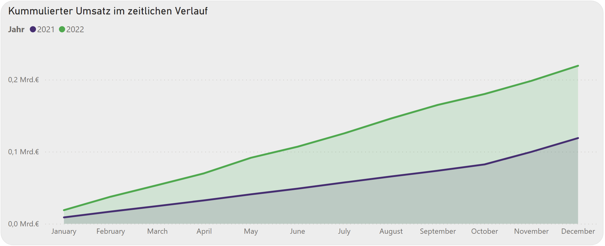
- Comparison with previous year's data: By comparing the current year's cumulative revenue with that of the previous year, companies can determine whether they are improving compared to the prior year. This is important for long-term strategic planning and goal setting.
Practical implementation in Power BI
In Power BI, a cumulative revenue curve can be created by combining various DAX functions and visualization tools. The steps include:
- Data preparation: First, revenue data must be correctly imported and prepared in Power BI. This involves ensuring that the data is correctly formatted and free of errors.
- Creating a cumulative measure: Using DAX functions such as CALCULATE and FILTER, a new measure is created to calculate the cumulative revenue.
- Visualization: Visualizing cumulative data in Power BI is essential for making complex information accessible and understandable. One option is to display the cumulative revenue trend using a line chart or another suitable visualization type in Power BI. The line chart is ideal for showing data trends over time. Alternatively, bar or area charts can be used. Bar charts can be used to compare cumulative data across different categories or segments, which is particularly helpful for analyzing the performance of various business units or products. Area charts, on the other hand, offer an alternative to line charts when you want to display only a single metric.