Power BI: Calculating the number of days


Mastering Time in Power BI – How to Effectively Calculate and Visualize Days
How can you effectively use the powerful date and time functions in Power BI? We answer this question and guide you through a detailed step-by-step tutorial on calculating the number of days between two dates. We also show you how to visualize the results in insightful project management reports. This is a guide for anyone looking to expand their Power BI skills and gain deeper insights into their data.
Introduction to Date and Time Functions in DAX
Date and time functions, powered by DAX (Data Analysis Expressions) in Power BI, are essential for data analysis and offer a wide range of applications in business environments. These functions enable complex time-series analysis, are vital for identifying trends and patterns, and play a key role in various business areas such as financial reporting and project management. By mastering these functions, you can analyze your company's performance over different periods, identify seasonal patterns, and create forecasts for future developments based on historical data, leading to more informed business decisions.
Step-by-Step Guide to Calculating the Number of Days Between Two Dates in Power BI
Calculating the number of days between two dates in Power BI is not only feasible but also intuitive, thanks to DAX functions. Here is a detailed guide on how to perform this calculation in Power BI:
1. Selecting Data Sources:
The first step is to ensure that your Power BI model contains the necessary data. You need two date fields between which you want to count the days. These could be, for example, the start and end dates of a project, a business quarter, or any other relevant period.
2. Creating a New Measure:
In Power BI, calculations are performed using a measure. Right-click on the table containing your date fields and select 'New measure'.
3. Using the DATEDIFF function:
The DATEDIFF function in DAX is your go-to tool for this task.
The syntax for this function is DATEDIFF(start_date, end_date, interval). This function calculates the difference between two dates. To calculate the number of days between two dates, specify DAY in the interval field. For example: DATEDIFF([Start Date], [End Date], DAY) returns the number of days between the [Start Date] and [End Date] fields.
.png)
4. Adjusting the formula:
You can customize the formula to account for different scenarios. For example, you can add conditions to count only business days or to exclude holidays.
5. Verification and troubleshooting:
Once you have created your measure, it is important to verify the results. Ensure that the calculated number of days is logical and correct. Check for common errors, such as incorrect date formats or missing values.
6. Advanced applications:
Once you are familiar with the basic functionality, you can perform more complex calculations, such as the average number of days between events or calculating time spans in hours or minutes.
By mastering these steps, you can fully leverage Power BI's powerful date and time intelligence features to gain deeper insights into your data and make informed decisions.
Application examples for calculating days in project management reports in Power BI
The ability to calculate the number of days between two dates in Power BI has a wide range of applications, particularly in project management. By integrating these calculations into project management reports, teams and managers can gain valuable insights and manage their projects more efficiently.
We focus on three key applications and explain them in more detail:
- Project timelines and milestones:
In project management reports, it is crucial to monitor project progress. By calculating the number of days between the project start and various milestones, managers can evaluate progress and quickly identify delays.
Implementation in Power BI: In Power BI, you can create a Gantt chart that displays task start and end dates as well as the calculated duration. The DATEDIFF function can be used to calculate the duration of each task. This visualization allows management to see at a glance which tasks are on schedule and which are falling behind.
Benefits for project management: This type of visualization not only helps monitor the current project status but also enables forward-looking planning. Teams can take proactive measures to avoid delays and allocate resources efficiently.
- Performance monitoring:
Monitoring the time required to complete tasks or project phases is an essential aspect of project management. It allows managers to evaluate team performance and identify bottlenecks.
Implementation in Power BI: By creating reports that show the average duration of tasks, managers can identify patterns. For example, a longer duration for certain task types may indicate a need for training or process inefficiencies.
Benefits for project management: This information is crucial for the continuous improvement of workflows and processes. It enables managers to take targeted measures to increase efficiency and productivity.
- Deadline management and monitoring:
In many projects, meeting deadlines is critical. Calculating the days remaining until a due date helps teams complete their tasks on time.
Implementation in Power BI: A report can be created that shows a list of tasks with their respective due dates and a column for the remaining days. This calculation can be updated automatically to provide up-to-date information at all times.
Benefits for project management: Such reports enable teams to set priorities and focus on upcoming deadlines. This helps ensure that schedules are met and increases customer satisfaction.
By focusing on these key applications, project managers can not only manage their projects more efficiently in Power BI, but also gain valuable insights for future planning and decision-making.
Visualizing results in Power BI: A key to success in data analysis
Once you have calculated the number of days between two data points in Power BI, the crucial step of visualization follows. Effectively presenting this data is essential for making complex information accessible and understandable. Choose the right type of visualization for your Power BI results:
- Bar and column charts are ideal for comparing the duration of different projects or tasks. They provide a clear and direct visual representation of varying time spans.
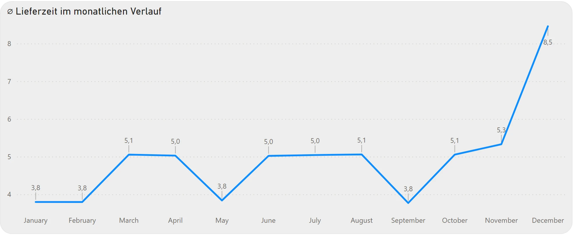
- Line charts are perfect for showing trends and developments over time. They are particularly useful for analyzing changes in project duration or other time-related metrics across multiple periods.
- Gantt charts are indispensable in project management, as they provide a detailed overview of project schedules and progress, highlighting the relationship between different tasks and their timeframes.
Incorporate interactive elements into your reports to enhance the user experience. Use filters and slicers that allow users to sort the displayed data based on specific criteria such as time periods, projects, or other parameters. Equally valuable are drill-down functions, which allow for switching from a general overview to more detailed data levels. These features are especially useful for diving deeper into the data to analyze the causes of delays or discrepancies.
Calculating the number of days between two dates in Power BI and visualizing them effectively is a powerful tool in data analysis. It not only enables a deeper understanding of time dynamics in projects and other business activities but also improves decision-making through clear and interactive presentations. Applying these techniques correctly in Power BI can lead to a significant increase in efficiency and productivity across various business areas. By mastering these methods, you can gain valuable insights and transform your data into meaningful stories that move your company forward.